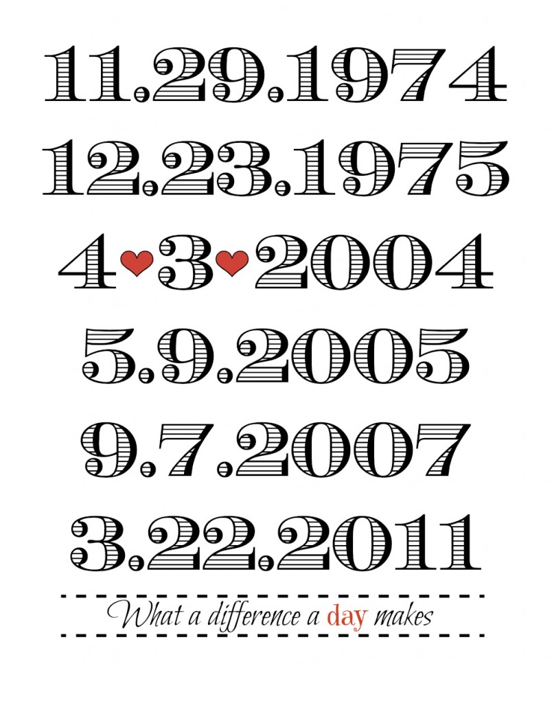
About a year ago, I saw this print on Pinterest and fell in love. Then I found a whole bunch of similar ones {like this, this, this and this}. I love things like this, because they make me all sappy and think about how a person’s life really can change in the span of just one day. I also love thinking that my husband and I both lived for 21 years without knowing the other one existed, and now I can’t imagine a life without him in it.
See? Sappy McSappercheese.
Anyways, I pinned it and added it to my list of 1,001 things I want to make. Today I finally made it, and it was super easy. {I realize it sounds weird when I say “it was super easy” and then proceed to present to you a tutorial that is approximately 150 pages long, but I promise you, it is. I am just including a ton of screenshots for you in case you’re unfamiliar with PicMonkey.}
 I used PicMonkey, which is an amazing, free photo editing website. They do have an upgraded membership available for anywhere from $2.75 – $5/month {depending on whether you do monthly or yearly payments}, and I personally think it’s worth the $33/year for all of the extra features you get. I only used one of the premium features in this tutorial, and I will point it out when I use it and will show you a free alternative.
To start, go to PicMonkey and click “Create a Collage.” You are going to be creating a blank document that you will use for your final print.
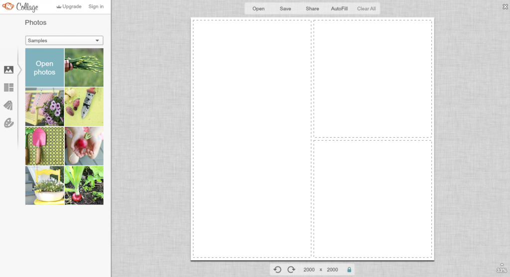
You will see a screen that looks like this.
For the next step, you will need to decide what size you want your final picture to be. Once you figure that out, you will need to change the size of the document, down where it says 2000 x 2000. To figure out what you need those numbers to be, you can check out this site. I want mine to be a final size of 11×14, so I need to change the size to 990×1260. {If you are doing anything other than a square, you will need to click on that little blue lock icon to unlock the proportions and allow the document to be a rectangle.}
Once you’ve sized the document appropriately, click “Save” to save it to your computer.
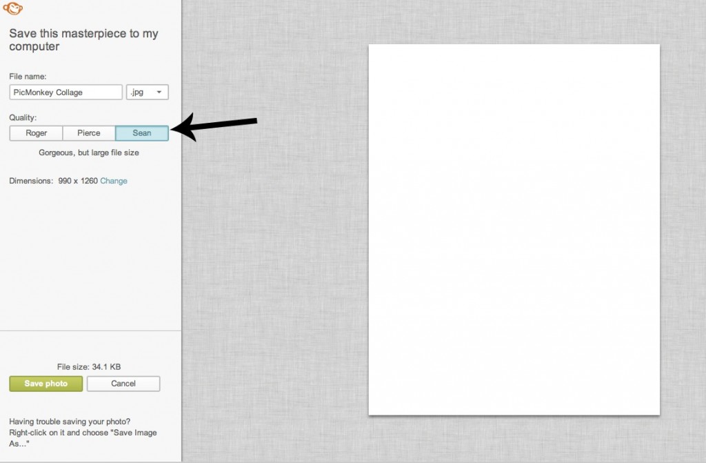
I’m not sure that this matters at this point, but I always save it as the highest file quality, which on PicMonkey is Sean. {Don’t ask me why, I don’t know.}
Once it’s saved, go back to the main PicMonkey page and now click “Edit a Photo.” Open up the blank document you just created.
Now comes the fun part!
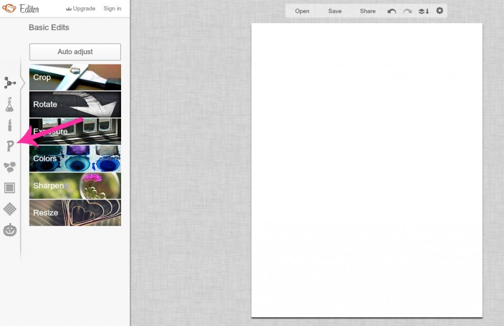
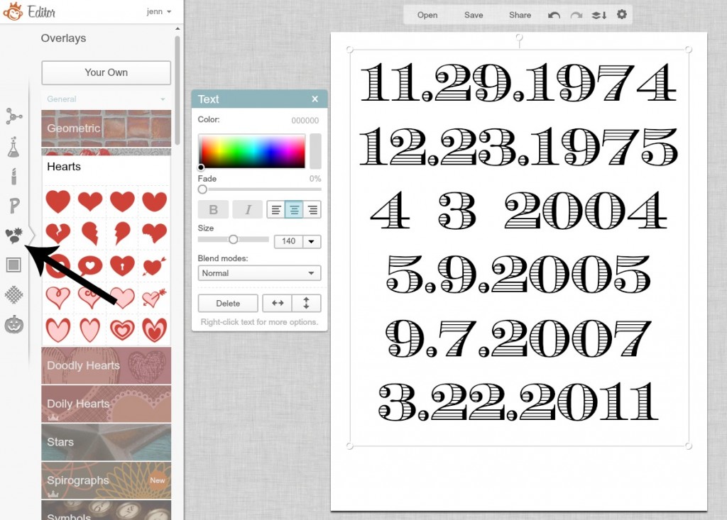
Click on the little “P” icon on the left hand side of the screen. {Like the fancy pink arrow on this one? I’m gettin’ all crazy up in here.}
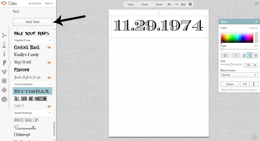
Now you can select what font you want to use for your dates. If you are using the free service and see a little crown next to the font name, that means it’s a premium font and you can’t use it unless you upgrade. No biggy, there are tons of great free fonts on there.
For this example, I used the EcuyerDAX font for the dates. Once you choose your font, click the “Add Text” button at the top and type in your first date.
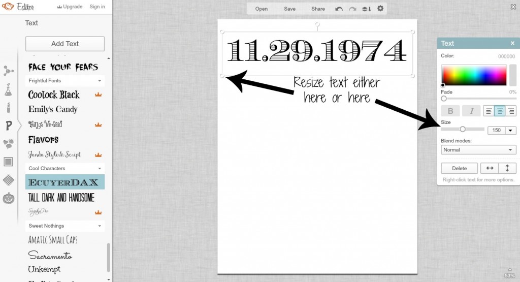
You can change the size of your font either by using the “Size” slider on the little “Text” box that pops up, or you can resize it by adjusting the little circles on the outside of the text box.
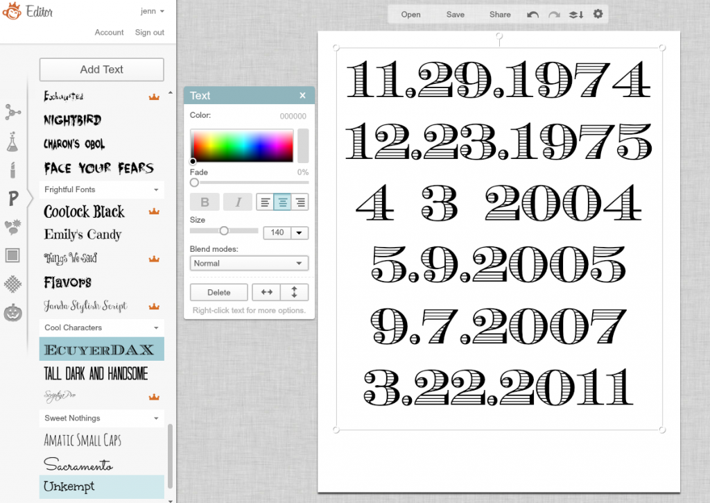
Now go ahead and type in each one of the dates you want to include, and center the text box . I included my husband’s birthdate, my birthdate, our wedding date, and the birthdates of all three boys. I found it’s easier to type them all into one text box {i.e., type in one date, press enter, type in the next date and so on}, because then you’re only worried about placing one text box instead of five or six or more. {I chose not to include the names underneath the dates like they did in a few of the inspiration photos, but if you want to do that, go nuts.}
You’ll notice I did spaces instead of periods in our wedding date. That’s because I’m about to open up a can of cutesy on you, so prepare yourself. Are you ready? Hearts. BOOM! Yeah, boiiii!
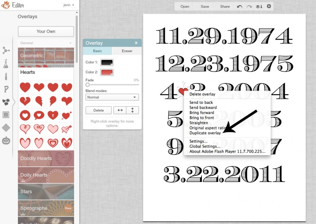
Click the little icon with the heart, sunburst and talk bubble right below the Fonts icon, and then click on Hearts. You can also check out Doodly Hearts, or if you have upgraded, Doily Hearts.
Click on the heart you want, resize it to fit between your numbers, and place it where you want. You can also choose to change the color if you’d like. On the heart I chose, the “Color 1” box is for the outline, and the “Color 2” is for the inside {I chose to give mine a black outline}, but you can play around with the colors if you choose a different one. Then, to easily make sure you’re getting the exact same size, Control-Click the heart {or right click if you’re on a PC} and select Duplicate Overlay.
Then place the 2nd heart where you want it.
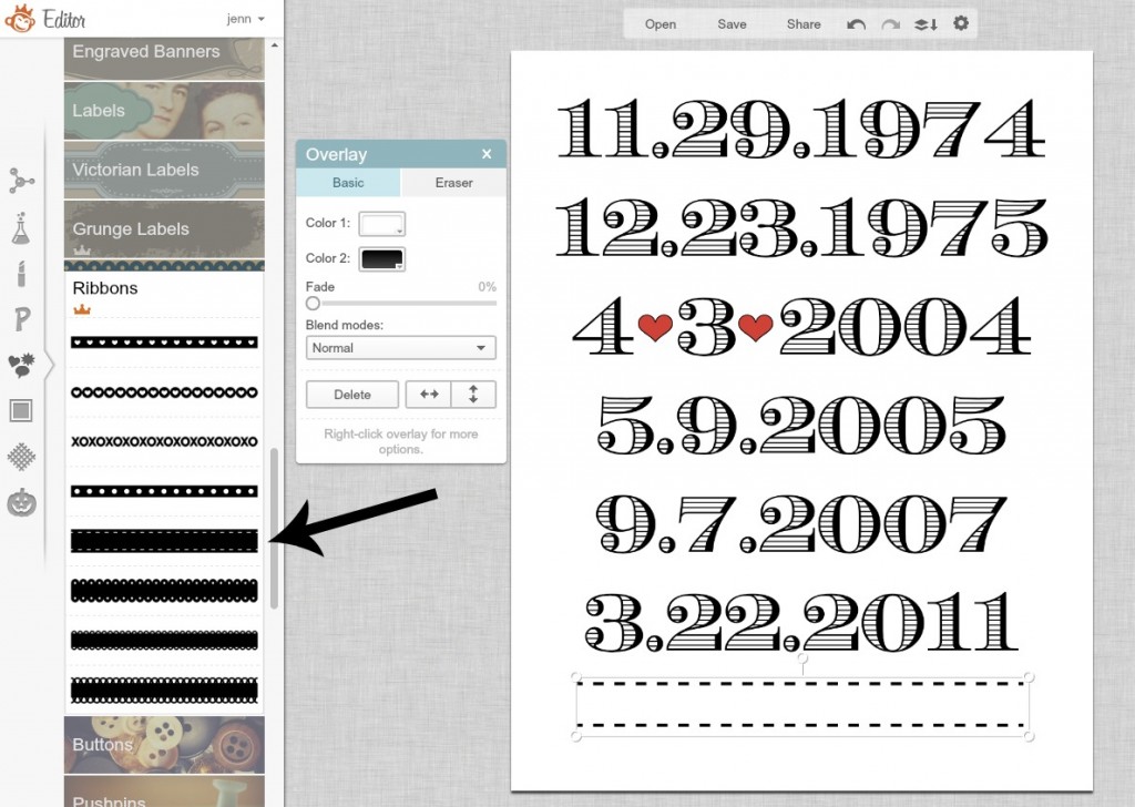
Now for the saying at the bottom. This is where I chose to use a premium feature, because I wanted to use a banner or a ribbon, and I wasn’t a huge fan of any of the free ones. But, it’s up to you to choose what you like.
To add a banner or label, just scroll down from the hearts until you get to the Scrapbooky section. You have a ton of different options, so just play around until you find something you like. I chose a saddle stitch ribbon, and flip-flopped the colors so the ribbon was white {Color 1} and the stitching was black {Color 2}.
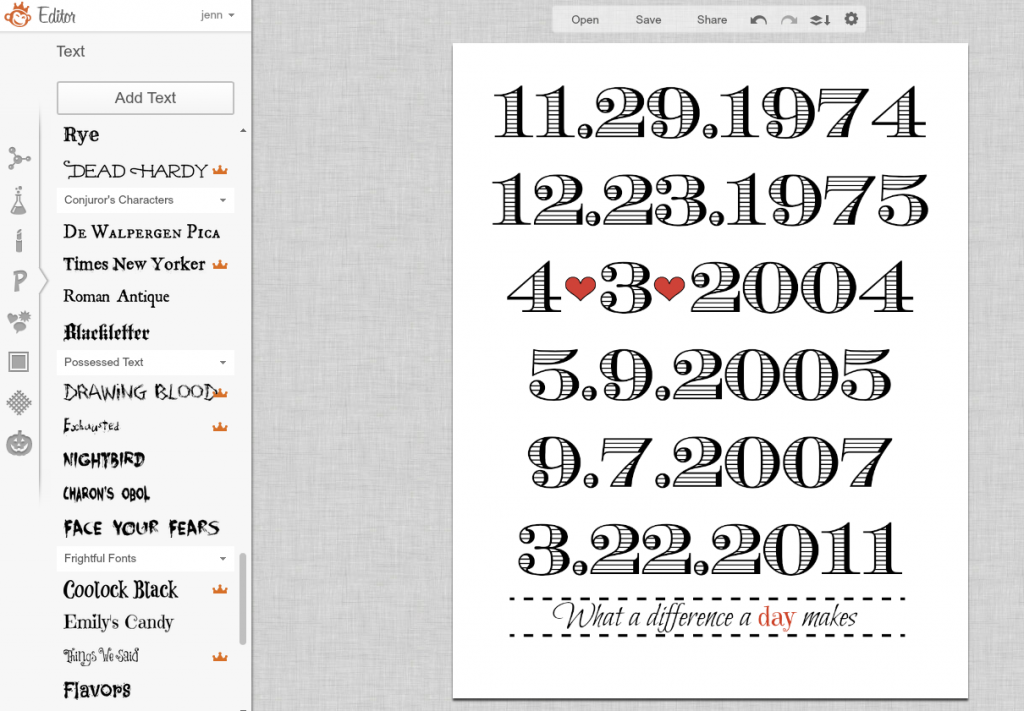
To add the saying to the ribbon, click on the “P” icon again and choose your font. Type in your text, drag it over so it’s on top of the ribbon, and resize and place it appropriately. I used Bilbo Swish Caps for the main part of the saying, and Emily’s Candy for the word “day.” If you use two different fonts, you may need to resize one of them so that they appear the same size, as some fonts are naturally larger or smaller than others. I also made the word “day” the same color as the hearts, just to fancify it up a bit more.
That’s all there is to it! Now, just save your photo {again, use the highest quality option, which is Sean}, and you can print it out wherever you want! I usually use Walmart’s one-hour service, just because it’s closest to me and pretty cheap, but if you have a good printer, you could even print it out yourself.
I don’t even know where in my house I’m going to put this yet, but I was so excited about the outcome and the fact that I actually made another project from Pinterest that I had to share it with you now. I will let you know what it looks like when I finally get it up somewhere.
{Click here to see where I link up and party!}
Disclosure of Material Connection: Some of the links in the post above may be affiliate links. Among others, we are a participant in the Amazon Services LLC Associates Program, an affiliate advertising program designed to provide a means for us to earn fees by linking to Amazon.com and affiliated sites. As an Amazon Associate I earn from qualifying purchases. This means if you click on the link and purchase the item, I will receive an affiliate commission. Regardless, I only recommend products or services I use personally and believe will add value to my readers. I am disclosing this in accordance with the Federal Trade Commission’s 16 CFR, Part 255: “Guides Concerning the Use of Endorsements and Testimonials in Advertising.”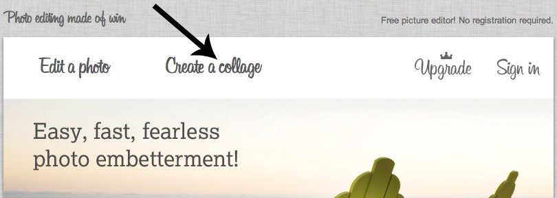
I am a picmonkey fanatic….and LOVE LOVE this tutorial! You did a GREAT job.
Stopping by from Creations By Kara Look What I Made linky party
Carolyn @ iamthecraftylady.com
I hope you will stop by for a visit!
This is super Jenn. It’ll look great as part of the gallery wall I’m putting together. Thanks for the hook up. I can’t wait for your first contribution post. I’m putting that one up on the wall too. 🙂
Love this!!! Can’t wait to try it. Thanks Jen
Is there any place that I can have my son’s wedding photo applied to canvas with this saying on it “What A Difference A Day Makes” and all the dates and special events layered right over the picture?